DESCRIPTION
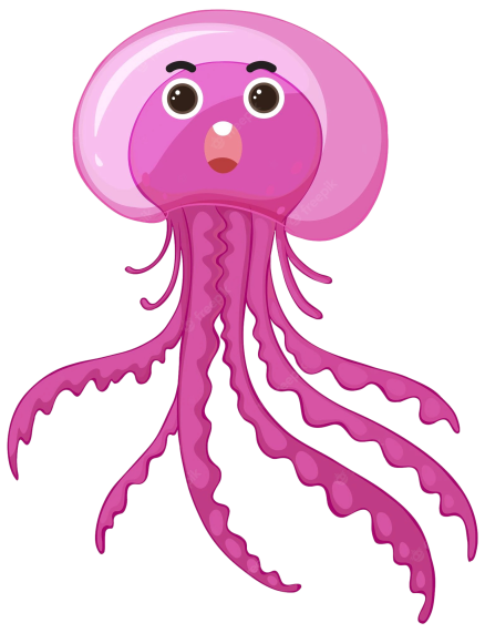
After reviewing many Zen Garden models and designs from others, we notice that there is no water theme so we thought that it will be cool to see how Zen Garden would look under the water. That’s why we decided to create an “Under the Water Theme”. We got inspired in the Hot air balloons theme, Mario Bros theme and the Stars Theme, so we will be working with similar tools.
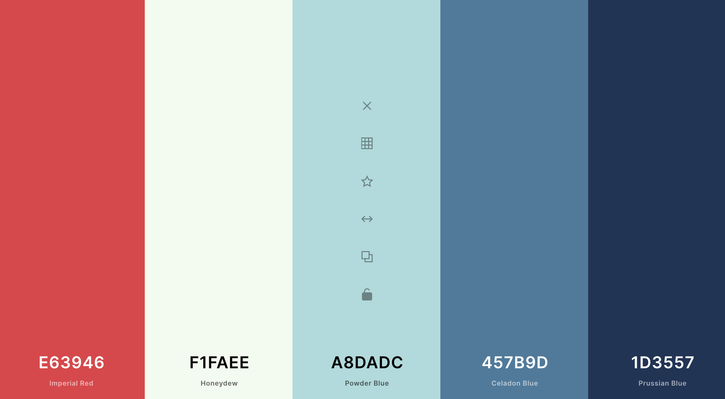
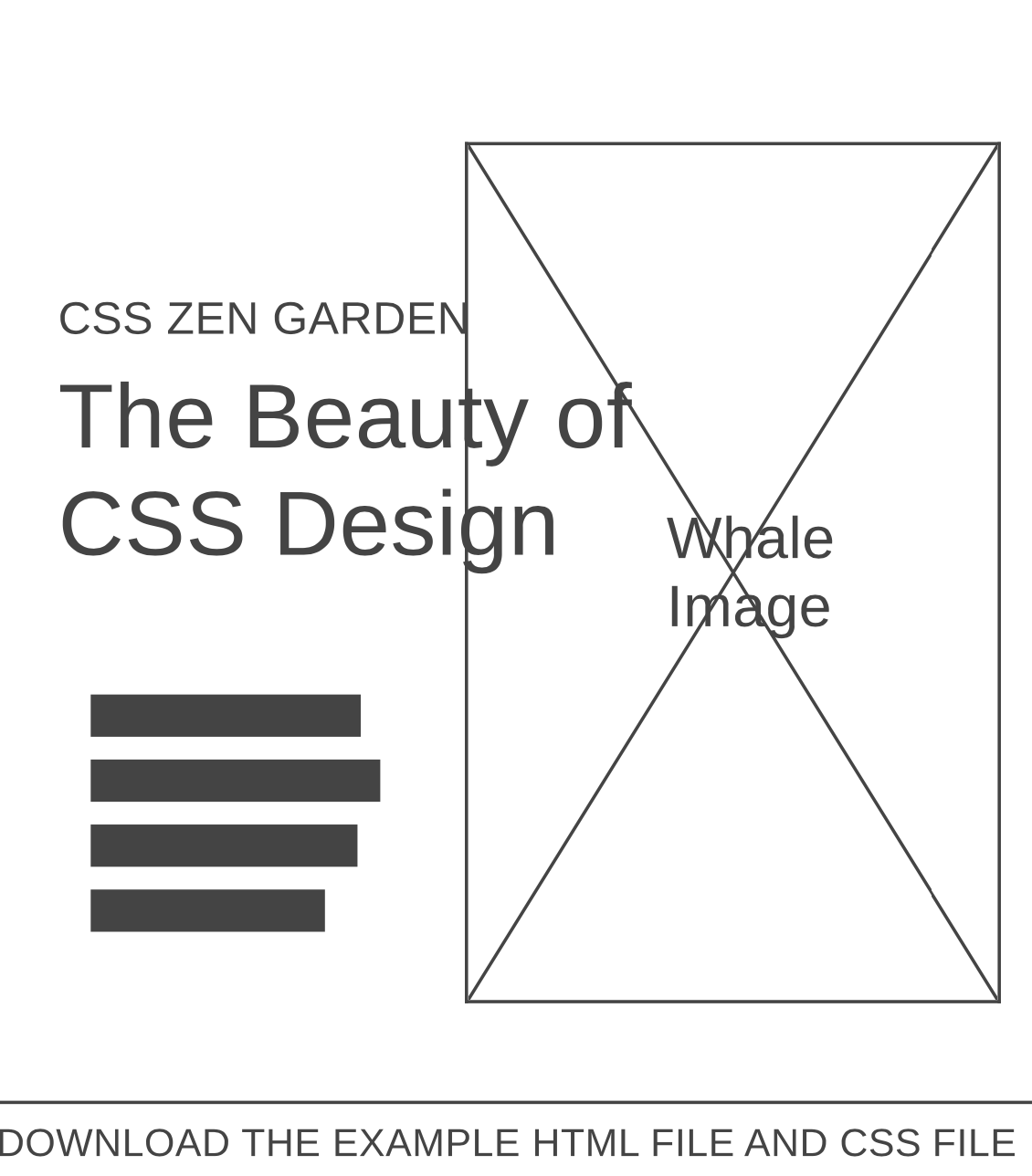
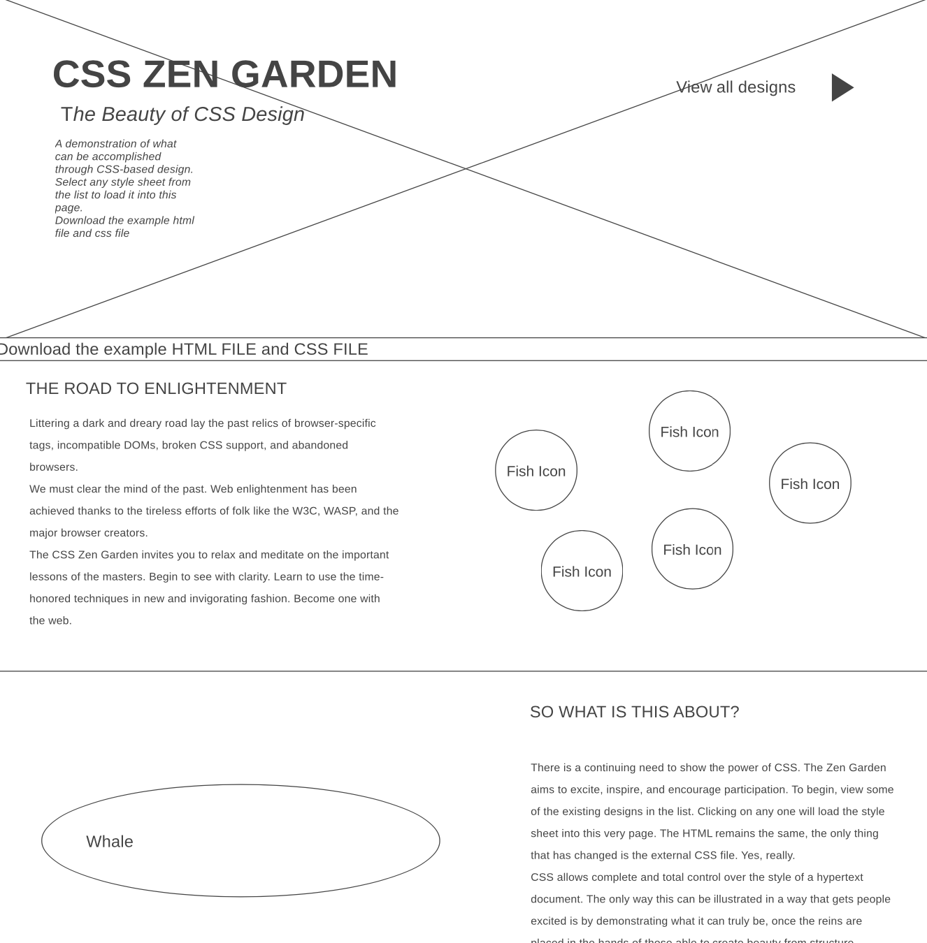
This Site Plan Includes the colors, fonts, referencial images, wireframes and group members that we will be working with. It is also designed with SCSS and based on the “Atomic Design Methodology”. This website is designed first in mobile view to large screen view, so small.scss file is the main styles.
We are so exited to bring this web site to reality and also for all things we will learn through this semester.
WDD 331| Group 8| BYU-I
Typography

Branch
font-family: 'Pattaya', sans-serif;
Lobster is one of the most popular web fonts, designed by Pablo Impallari. Pattaya is a version of Lobster extended into Thai, and supports Latin and all variations of the Thai script with an informal loopless design. However, vertical metrics (that effect line-spacing) had to be adjusted in order to support Thai vowels and tone marks, so this is published as a separate family.
Read More...
Headings
font-family: 'Playfair Display', serif;
Playfair is a transitional design. In the European Enlightenment in the late 18th century, broad nib quills were replaced by pointed steel pens as the popular writing tool of the day. Together with developments in printing technology, ink, and paper making, it became to print letterforms of high contrast and delicate hairlines that were increasingly detached from the written letterforms.
Read More...Paragraph

font-family: 'Roboto', sans-serif;
Roboto has a dual nature. It has a mechanical skeleton and the forms are largely geometric. At the same time, the font features friendly and open curves. While some grotesks distort their letterforms to force a rigid rhythm, Roboto doesn’t compromise, allowing letters to be settled into their natural width. This makes for a more natural reading rhythm more commonly found in humanist and serif types.
Read More...Color Scheme


